The STORY:
“Our mission is to spread joy, one bite at a time, while honoring the tradition of homemade goodness and the bonds of family.”
Musus Bites traces its roots back to the heartwarming kitchens of Venezuela, where the love for exquisite desserts was passed down through generations. Originally known as ‘’Tamesis’’, the brand’s journey took a transformative turn when its founder, inspired by cherished memories of homemade guava cookies and the nurturing spirit of her godmother “Musu”, embarked on a mission to bring the soulful flavors of her homeland to American families.
From humble beginnings in a Californian kitchen, Musus Bites was born, marrying tradition with innovation to create desserts that evoke the warmth of home and the richness of heritage.


The challenge:
Have you ever tasted a memory? That’s exactly what Musu’s Bites strives to create—a journey back home, wrapped in the warmth of a single bite, where nostalgia and indulgence blend into a story of flavor and love.
Creating the brand identity for Musu’s Bites was a challenge that required balancing tradition and modernity while maintaining a strong emotional connection to its roots. The brand was born from the nostalgia of homemade Venezuelan desserts and needed to translate that authenticity into the U.S. market.
The challenge was to ensure that the visual identity conveyed warmth and familiarity, evoking a sense of home while also reflecting a contemporary and appealing look for a broader audience. Additionally, the branding had to be flexible, capable of adapting to multiple applications—from packaging to social media—without losing consistency or recognition.

The solution:
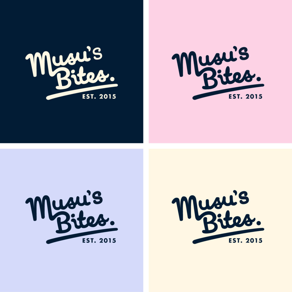
More than just a visual mark, the logo serves as a personal signature of the founder, as if she were sealing each of her creations with her own hand. The logo design respects the artisanal nature of the brand, using organic and fluid typography that communicates warmth and authenticity.
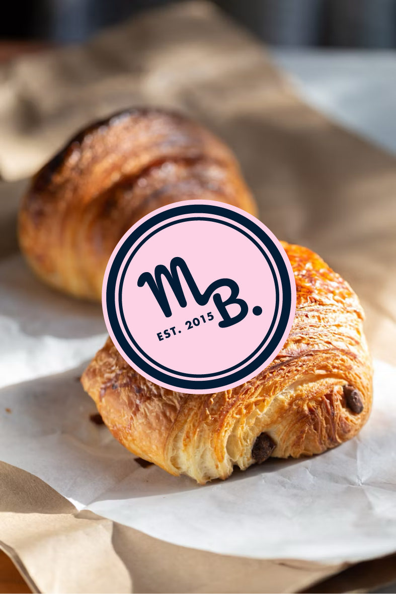
To achieve this, I developed a versatile logo system, including primary, secondary, and submark logos, ensuring the identity could be applied effectively across different formats and sizes.
This adds a deeply personal and handcrafted touch, reinforcing the intimacy and dedication behind every dessert. Additionally, the apostrophe in the logo takes the shape of a drop, reminiscent of cream or dough, symbolizing the essence of Musu’s homemade recipes. This subtle detail enhances the fluidity of the typography, echoing the smooth textures and delicate artistry that define Musu’s Bites.


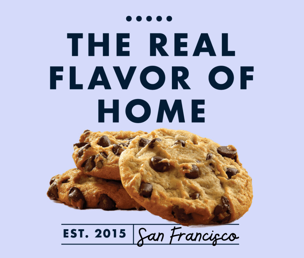
The photography and digital strategy were carefully designed to project authenticity and closeness. The social media imagery focuses on capturing Musu’s Bites’ essence through detailed product shots, behind-the-scenes moments, and user-generated content, creating a strong community around the brand. The art direction ensures a clean and warm aesthetic, prioritizing natural lighting and soft editing to maintain a welcoming and nostalgic feel.
With a solid, flexible, and emotionally engaging brand identity, Musu’s Bites doesn’t just stand out in the market—it becomes a sensory and emotional experience. Every visual element is designed to communicate heritage, quality, and authenticity, ensuring that each brand touchpoint reinforces its promise: offering desserts that go beyond taste, creating unforgettable moments in every bite.

The color palette plays a crucial role in setting both an emotional and strategic tone. Each color was carefully selected to reinforce the brand narrative and ensure a strong visual presence across all platforms.
- Dark Blue adds sophistication and trust, positioning the brand at a premium yet accessible level.
- Pale Pink creates a sense of warmth and sweetness, evoking the softness of homemade desserts and nostalgic childhood memories.
- Bone reinforces a comforting and inviting atmosphere, reminiscent of the golden hues found in traditional baking.
- Light Lavender-Blue introduces a touch of freshness and modernity, bringing a contemporary contrast while maintaining the brand’s soft and approachable essence.


Finally, To further enhance the handcrafted aesthetic, I designed minimalist illustrations and graphic patterns that complement the identity without overpowering it. The simple line-art illustrations, inspired by homemade baking, add a unique visual signature and reinforce the brand’s storytelling. In packaging, these elements were strategically incorporated to elevate the customer experience, turning each purchase into a personal and special moment.
