The challenge:
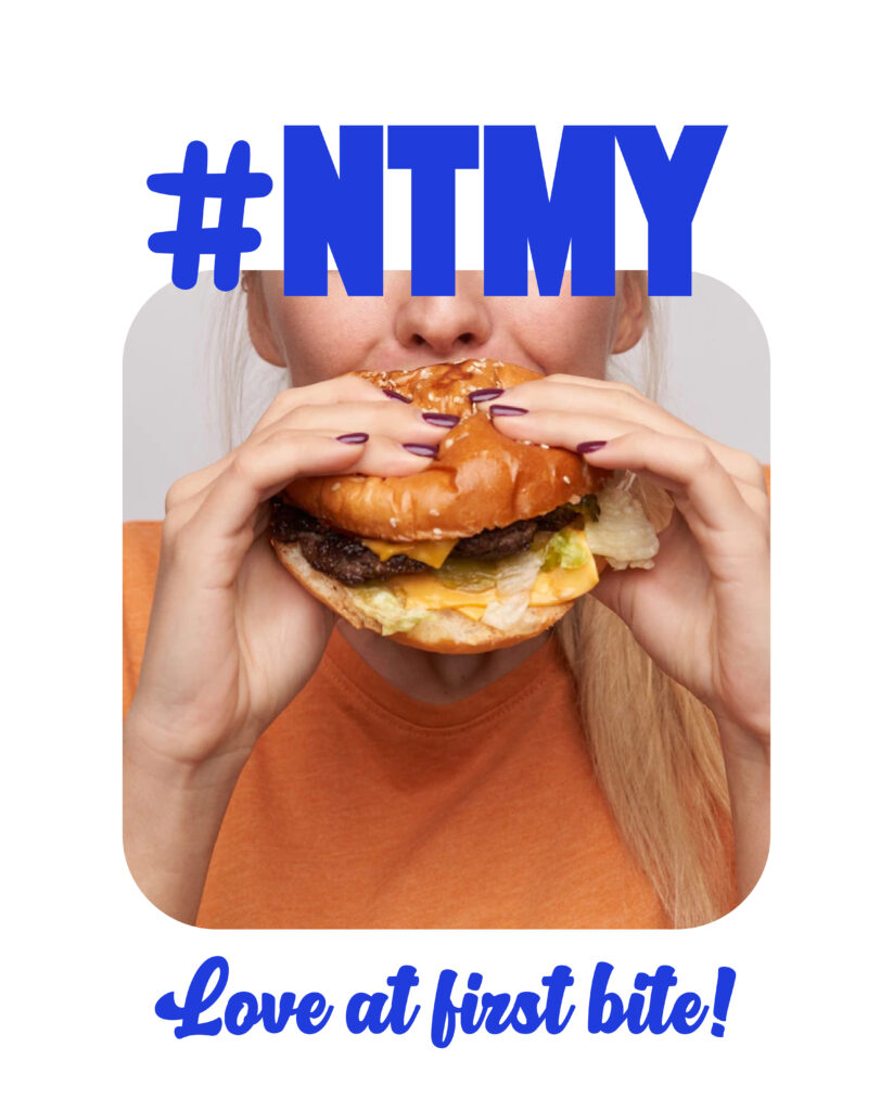
Have you ever experienced love at first sight? That’s precisely what “Nice to Meat You” aims to achieve, but in this case, “At first bite” in a culinary romance that ignites from the very first glimpse.
My mission was to embark on a branding journey with a unique theme: “Fall in love on every meal” The challenge was to craft an enchanting and unforgettable brand identity steeped in vintage vibes, evoking the nostalgia of our first youthful crushes.
Beyond the competitive landscape of the burger industry, “Nice to Meat You” sought to make every customer feel as if they were in the throes of a passionate love affair—with burgers, of course. The brand aimed to breathe life into this affair through the charming embrace of its vintage-themed characters.
Moreover, “Nice to Meat You” aimed to cast a wide net, capturing the hearts of both devoted patrons and a younger audience yearning for not just a flavorful experience but an aesthetic one too. The challenge lay not merely in preserving its unique identity but in seamlessly evolving it to resonate with a newer generation that craved the marriage of taste and visual allure. Striking the perfect balance between nostalgia and modernity was paramount to ensure the brand’s allure remained as captivating and relevant as ever.

The solution:
The brand centered its entire identity around the theme of “Love at First Bite” with the introduction of unique and endearing vintage characters—a cupid burger and a sexy soda cup. These characters became the embodiment of the brand’s promise, creating a cohesive and memorable brand image.
The heart of the solution was these charming characters that adorned its branding. The cupid burger and sexy soda cup were carefully crafted to embody the joy of savoring a delicious burger and sipping a delightful beverage. Each character had its unique personality—the cupid burger, a symbol of the irresistible allure of their burgers, and the sexy soda cup, representing the cool and refreshing drinks offered. These characters were more than mere mascots; they were the living, breathing embodiment of the brand’s promise of love at first bite.
The color palette, consisting of red, beige, royal blue, and rose, was an essential element of the solution. These colors were carefully chosen to evoke a sense of nostalgia while remaining visually appealing to a modern audience. The red symbolized the passion for burgers, the beige conveyed a classic and timeless feel, the royal blue added a touch of elegance, and the rose brought a hint of sweetness to the brand’s identity.
Incorporating these characters and the color palette into the packaging, advertisements, and promotional materials created a cohesive and engaging brand narrative. It made “Nice to Meat You” more than just a burger chain; it became a destination for a love story with burgers and beverages. The design strategy aimed to transport customers to a bygone era, where every burger bite and sip of soda were nostalgic and cherished experiences.


The second part of the solution involved meticulous consideration of typography and messaging. A classic yet approachable typography was used to communicate the brand’s messages. The design balanced nostalgia and modernity, making “Nice to Meat You” both timeless and trendy.
“Nice to Meat You” successfully communicated that every visit was not just about a meal—it was an opportunity to experience love at first bite, a promise upheld by its unique and charming characters, and the irresistible allure of its burgers and beverages. This branding solution captured the hearts of its loyal patrons while attracting a fresh and younger audience, ensuring that the brand remained distinct and engaging in the highly competitive burger industry.
Illustrative Approach: Unique hand illustrations were developed, each telling a story of sharing and connection. These were complemented with positive and engaging messages that reinforce the brand’s core values.
Vibrant Design Elements: A lively color scheme was chosen to appeal to the target demographic. The use of bright, inviting colors makes the packaging stand out on shelves and resonates with a youthful audience.
Typography and Messaging: A blend of friendly and approachable typography was used to communicate the brand’s messages. The design balanced modernity and warmth, making the brand approachable yet trendy.


