Kizuma

A bowl of ramen. A spirit of sharing.

An expressive identity for a ramen brand built around the warmth of gathering over food. Character illustration, distinctive lettering, and a connected visual language bring Kizuma’s promise of “The spirit of sharing” to life.

Brand identity Visual storytelling Illustration Brand applications
  • Instagram
  • Illustrator
  • Photoshop
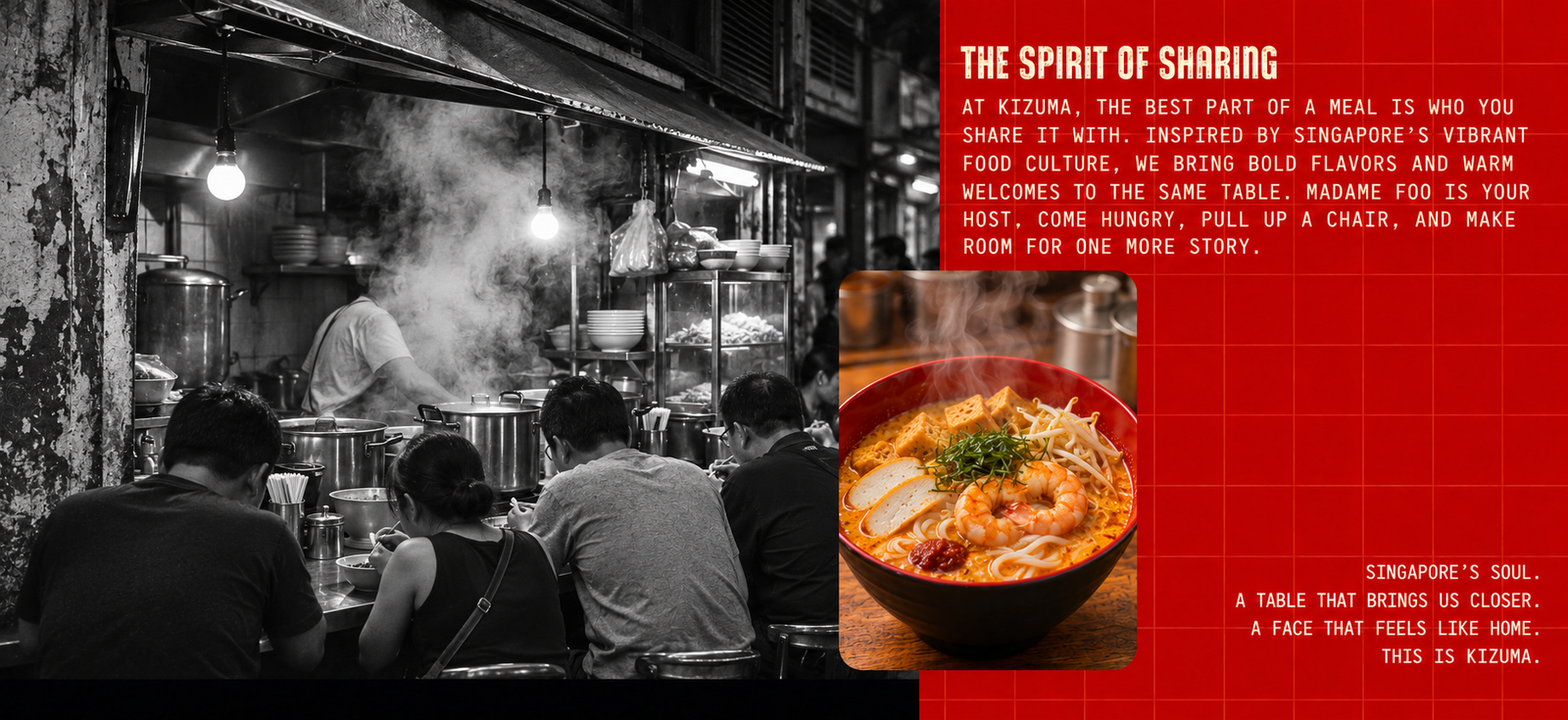
Kizuma Singapore street food, steam, and laksa

My role

Brand identity design, visual concept, and development of the illustrated brand language.

Creative scope

Character and wordmark, color and composition, and visual applications across print and digital formats.

Sector

Food & beverage / Ramen & hospitality

01. The challenge

Give the flavor a personality of its own.

Ramen brings a rich visual world with it: steam, bowls, counter seats, and the energy of a busy kitchen. The creative challenge was to give Kizuma a recognizable personality within that world.

The identity needed to communicate appetite and warmth while giving people something specific to remember: a face, a name, and a feeling they could associate with the brand.

I approached the project around a simple idea: a meal can become a moment of connection. That idea became the foundation for the character, the visual tone, and the way the identity comes together across applications.

02. The creative direction

Make sharing the heart of the brand.

“The spirit of sharing” gives Kizuma an emotional starting point. It shifts the expression from the product alone to the people and occasions around it: a shared table, an inviting atmosphere, and the pleasure of eating together.

The visual direction connects that warmth with a stronger graphic presence. An expressive wordmark gives the name energy; an illustrated host gives it a human face; repeated graphic elements make the pieces feel related.

Three principles organize the system: personality, appetite, and connection. Each has a clear job, so the identity can change format without losing its character.

01 / Personality

A face to remember.

Use a distinctive illustrated character to make the brand feel personal, welcoming, and immediately recognizable.

02 / Appetite

Let the food speak.

Pair expressive graphics with close, textured food imagery that keeps the ramen at the center of the experience.

03 / Connection

Build a shared language.

Repeat the character, lettering, color relationships, and illustration style across different sizes and compositions.

Construction study of the Kizuma wordmark
Wordmark study: angular forms, compact rhythm, and a distinctive silhouette.
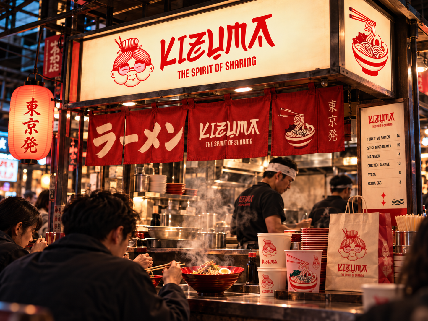
Kizuma storefront and brand identity application
The identity applied to a warm, characterful ramen storefront.
Cultural inspiration

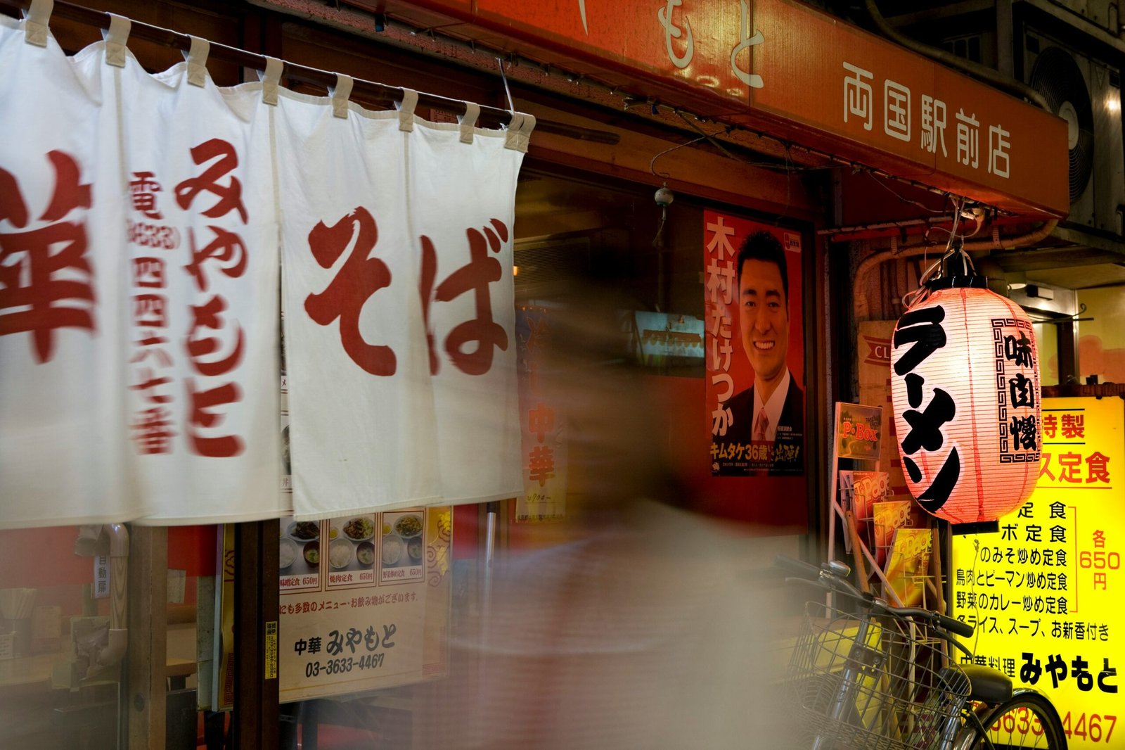
Singapore’s food culture. A shared creative starting point.

Singapore’s hawker culture brings Chinese, Malay, Indian, and other culinary traditions into shared dining spaces. That connection between food, people, and place gives Kizuma an emotional direction: a brand with the energy of street food and the warmth of a shared table.

The design translates that idea through layered compositions, expressive lettering, noodle-like curves, and a vivid red palette. The ramen format gives the story its visual anchor, while the idea of sharing connects the different elements.

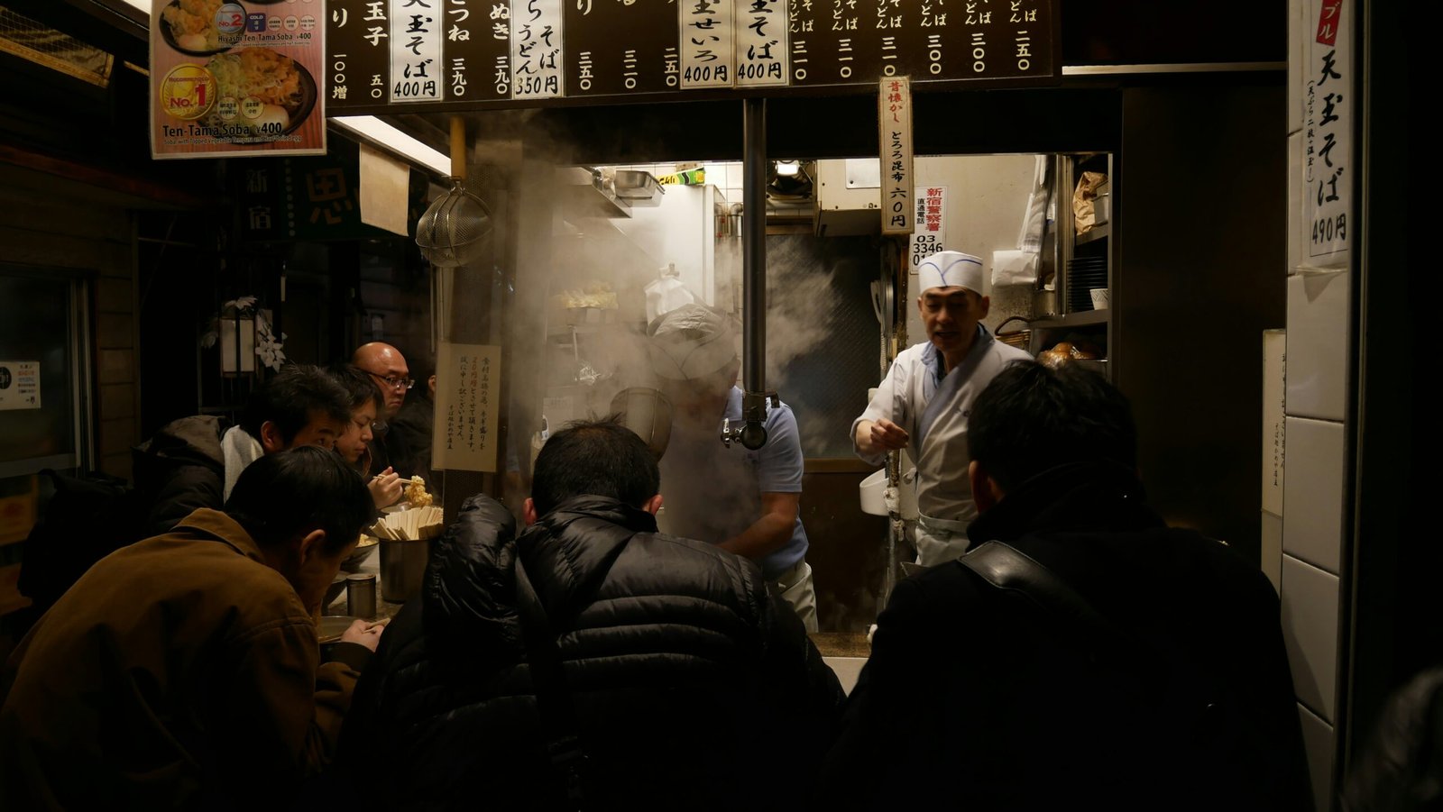
Atmosphere reference — open kitchen, shared counter, and movement
Shared counters / proximity and connection.
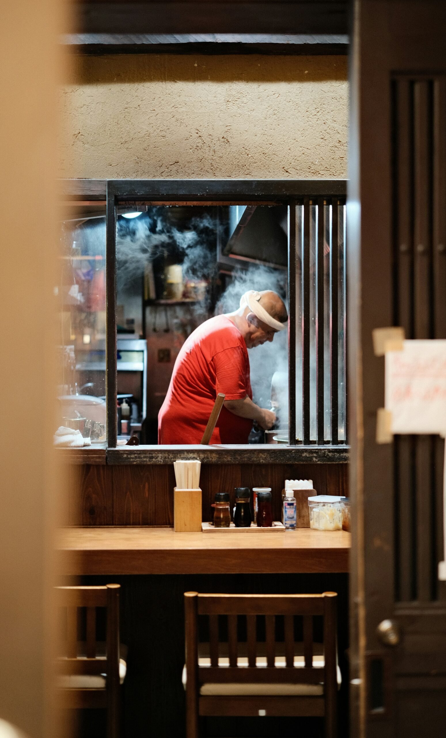
Atmosphere reference — framed view of a working kitchen
Visible preparation / craft and human presence.
Atmosphere reference — layered signage and street-level restaurant entrance
Street-level rhythm / layers, light, and visual energy.
03. The identity

An expressive name. A welcoming face.

The identity pairs a bold, angular wordmark with the softer linework of Madame Foo. That contrast gives Kizuma both presence and warmth: the lettering brings energy, while the character makes the brand feel approachable.

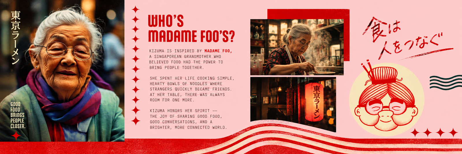
Madame Foo is the illustrated host of the brand world. Her round glasses, gentle expression, and noodle-inspired hair create a distinctive silhouette that works alongside the name or as a recognizable graphic element in its own right.

The character is a storytelling device within the identity. It gives the brand a way to express hospitality visually, without relying on a lengthy explanation.

Madame Foo character exploration and brand storytelling board
Madame Foo: a character-led approach to communicating warmth and hospitality.
Lettering with energy

Sharp changes in direction and an irregular rhythm make the wordmark expressive while keeping the name as the central identifier.

A human point of connection

Madame Foo introduces warmth and gives the system a recognizable face beyond the wordmark.

Illustration with a shared rhythm

Curved noodle lines, bowl shapes, and fine graphic details connect the food illustrations with the character’s linework.

A flexible visual family

The name, character, and food illustrations can appear together or independently, giving different layouts a clear family resemblance.

Madame Foo character study in dark and red linework
Character study / an expressive face in a consistent line language.
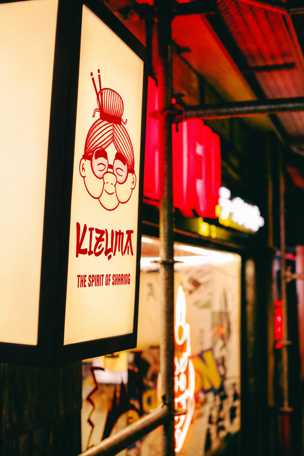
Illuminated Kizuma sign featuring Madame Foo
Signage mockup / the character as a recognizable brand cue.
Ramen red
Warm cream
Soft blush
Deep teal

Red gives the system a strong visual anchor. Cream and blush soften the compositions, while darker backgrounds provide contrast. Together, these colors give the brand range while keeping its different applications visually connected.

04. The art direction

Warmth you can almost taste.

The imagery brings a sensory layer to the graphic identity. Close framing, the texture of noodles, glossy broth, and the contrast of dark settings with bright food make the meal feel immediate.

The art direction moves between two registers: bold, graphic compositions for recognition and atmospheric imagery for appetite. The illustrated bowl bridges the two, translating the product into the same visual language as the brand.

Rather than making every image perform the same task, the system gives each one a purpose: introduce the personality, establish the mood, or bring attention back to the food.

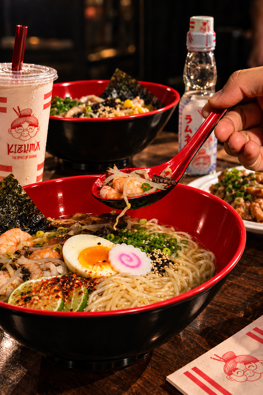
Red and black Kizuma ramen bowls and tableware
Appetite / color, texture, and the bowl as the hero.
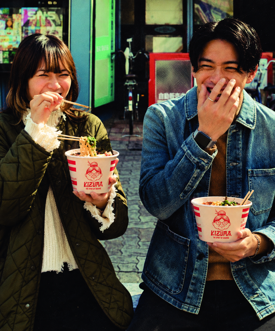
Two diners sharing a lighthearted moment with Kizuma ramen
Connection / the feeling behind the spirit of sharing.
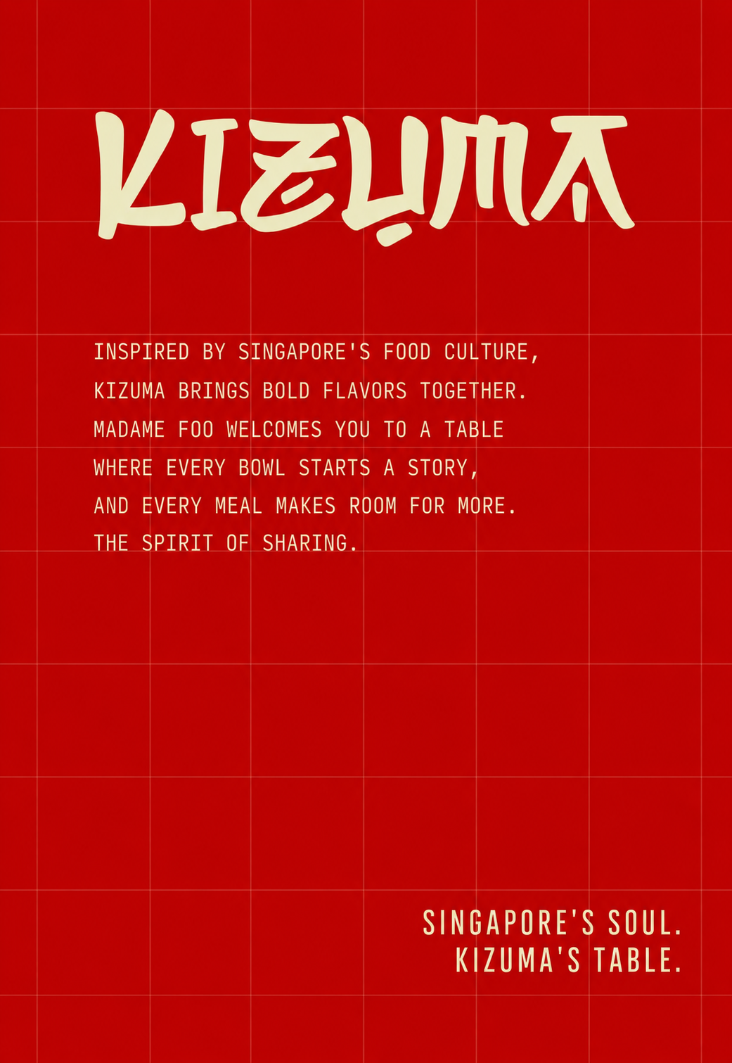
Kizuma red poster inspired by Singapore food culture
Expression / bold typography, red grid, and a clear brand voice.
Food imagery creates appetite; graphic compositions keep the identity visible.
05. The applications

One personality. Different ways to show up.

The application studies explore how Kizuma can retain its character across editorial layouts, mobile compositions, and a social content system.

The hierarchy changes with the format. Some layouts lead with the character, others with food or a short message. Consistent color relationships and repeated illustration keep those variations connected.

This creates room for expression without making every piece identical: a recognizable system with enough variety to sustain a brand story.

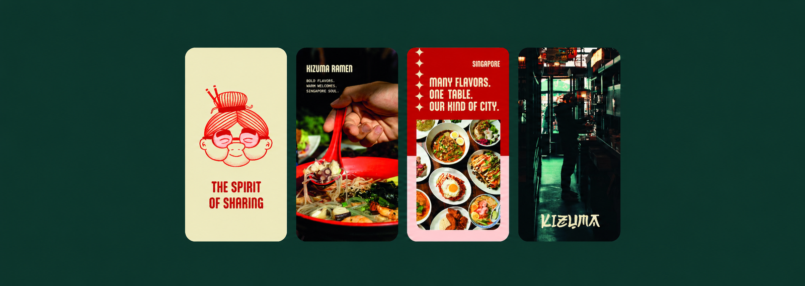
Kizuma mobile-format brand application studies
Mobile-format visual studies: character, food, and atmosphere within one connected identity.

Recognize.

The character and wordmark provide clear anchors when the brand needs to introduce itself quickly.

Connect.

Food imagery and a welcoming visual tone support the central idea of enjoying a meal together.

Adapt.

A shared palette and illustration language let the identity move between formats without losing coherence.

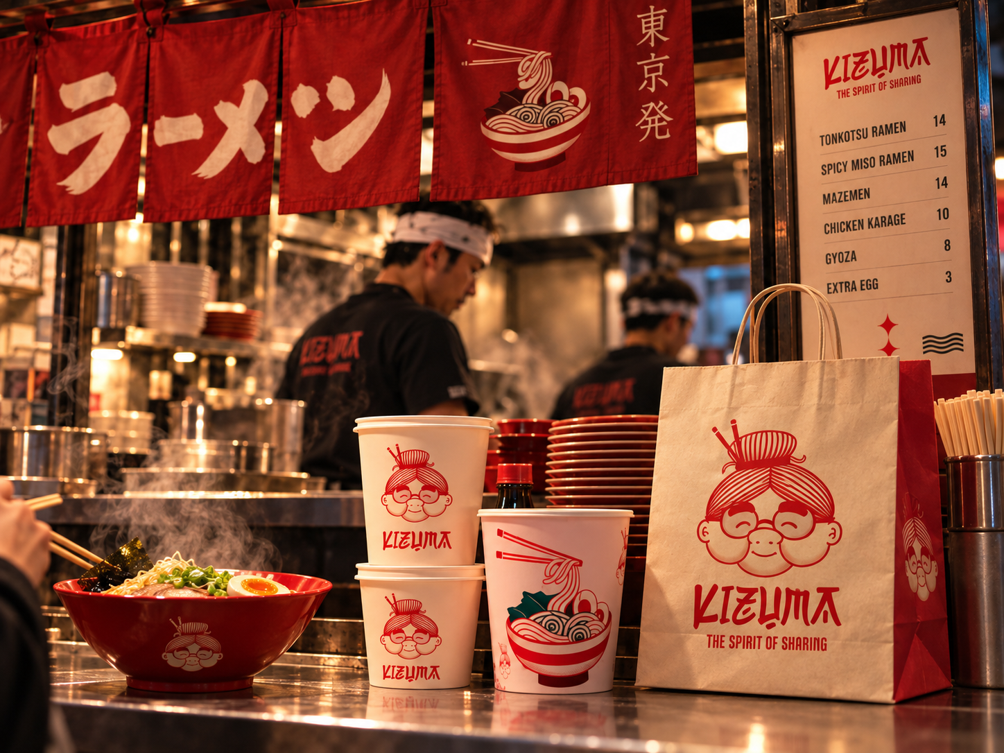
Kizuma counter mockup showing bowls, cups, bags, and signage
06. The visual system in use

From the counter to the kitchen.

The application mockups show the identity working across the ramen counter and kitchen. Signage, bowls, cups, bags, and apparel bring the wordmark, Madame Foo, and the illustrated food language into one connected setting.

Consistency comes from recurring visual cues rather than a single rigid layout. The mockups explore how those cues can connect the guest-facing experience with the people and materials behind it.

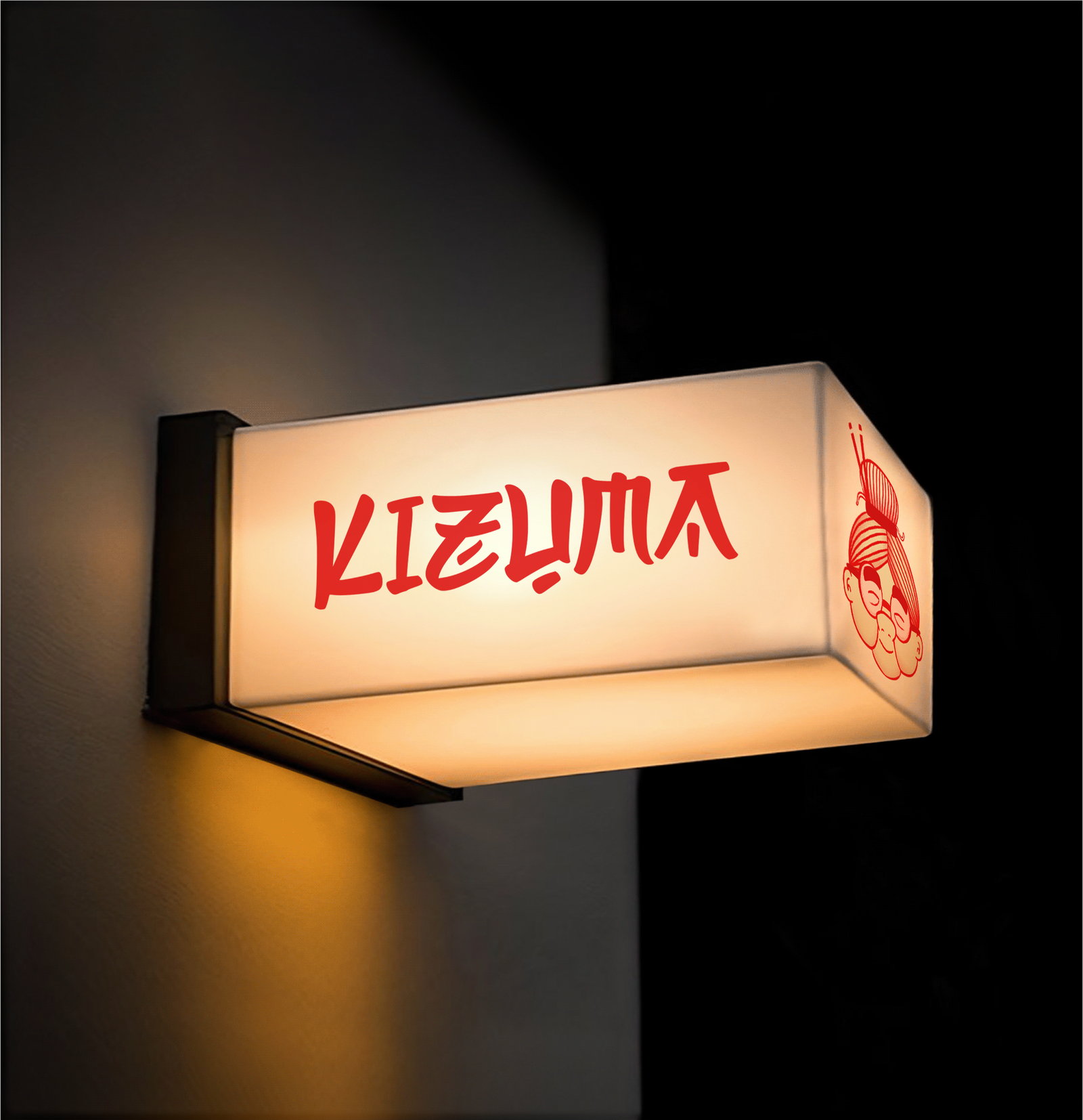
Illuminated Kizuma wordmark sign mounted on a dark wall
Wordmark signage / a clear presence at the entrance.
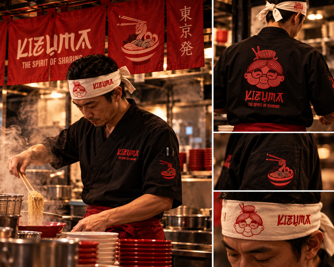
Kizuma chef apparel and kitchen mockup
Apparel mockup / the character and wordmark carried into the kitchen.
07. The outcome

A brand world built around the table.

The project brings together a distinctive wordmark, a character-led narrative, an illustrated food language, and a flexible set of visual applications. Each part supports the same promise: the spirit of sharing.

The creative outcome is a coherent identity that can express both personality and appetite. Its strength lies in the relationship between the pieces: the name draws attention, Madame Foo adds warmth, and the food imagery grounds the story in the meal.

A clear point of view.

Sharing gives the identity a focus that connects its visual choices, from the illustrated host to the atmosphere of the imagery.

A system beyond the logo.

The application studies demonstrate how the same creative direction can support different messages, compositions, and viewing contexts.

Explore more projects

Scroll to Top